
Color Wheel and Color Complements
[ Animate]
The Color Wheel describes the relationships between colors. It is laid out so that any two PRIMARY COLORS (red, yellow, blue) are separated by the SECONDARY COLORS (orange, violet, and green). Any two primaries will mix to create a secondary color. A TERTIARY COLOR can be mixed from a primary and a secondary color.
Hint
Primary Colors are basic and cannot be mixed from other elements. They are to color what prime numbers are to mathematics. One can mix two primaries to get a Secondary Color. You will notice that each Secondary Color on the Color Wheel is bounded by two primaries. These are the components that one would mix to get that Secondary Color.
Color Complements are color opposites. These colors contrast each other in the most extreme way possible. They also help to make each other more active. Color Complements are on opposite sides of the Color Wheel.
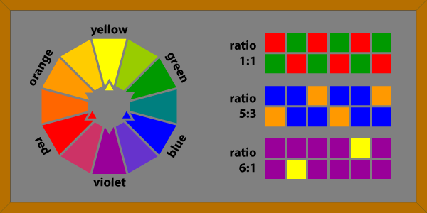
The ratios and illustrations on the right of the chalkboard are ideal amounts of color complements according to Johannes Itten. He believed that equal amounts of red and green are appropriate (1:1 ratio). Blue and orange are different in value, so they their ratios need adjustment (5 blue:3 orange ratio). The same is true of violet and yellow (6 violet:1 yellow). These ratios were probably devised to counter the intensity of colors like yellow and orange.
Hint
All colors travel in waves within light. Color Complements have drastically different wavelengths and, consequently, cause some perception problems for a viewer if they are placed close to each other in a work of art. The cones and rods of the eye cannot handle so much information, so we sometimes detect a quivering or optical distortion when two complements are used near each other.