| COLOR SATURATION AND INTENSITY |
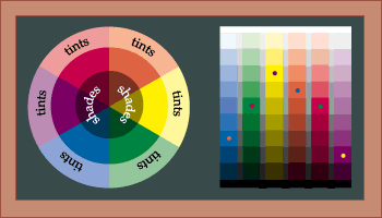
Color has value. This is the darkness or lightness of a particular color. We can divide these value changes into SHADES and TINTS. Shades are the relative darkness of a color and Tints are the relative lightness of a color. These divisions are created by darkening or lightening the PURE HUE. This is the base color at its full INTENSITY. It is important to note Intensity of a color here because a value of, lets say, red can be the same as a medium TONE of that same color. A Tone can be the same value, but can be grayed in such a way that it is not at the highest degree of Intensity. The Pure Hue has the highest SATURATION of color. This is illustrated in the middle ring of the Color Wheel above. The outer ring of TINTS illustrates what happens to a Pure Hue when white is added. The center section of SHADES shows the effect of black on the Pure Hue. The four graphs at the right of the chalkboard show relative values of three colors and gray. The star in each column shows the purest hue of the group. It is important to note that the pure hue changes with the relative value of that color. For example the pure hue of yellow is lighter than medium gray, whereas the pure hue of blue is much darker than middle gray. HINT: When mixing pigment it is advisable to use a pure color rather than a mixed color to achieve highest saturation of color. When two pigments are mixed, their relative intensity decreases. Therefore it if a strong green was the intention, it may be more beneficial to get a green pigment instead of mixing blue and green. This effect seems to become more noticeable with as more pigments are added. updated 07/13/04 |
|

Custom Search
|